The Hindu
Revamping the iconic newspaper's mobile application
While at Ashoka University, I had been surrounded by academicians and have felt the need to always be up to date with events in the global or domestic domain. I was always on the hunt for a news app that provides credible news, through a well-designed user interface.
The Hindu is an Indian national daily newspaper, renowned amongst many as a credible source of information. Many students appearing for Union Public Service Commission (UPSC) examinations are advised to read it religiously. The paper provides insightful editorials. Therefore, I was quite surprised when I first stumbled upon The Hindu app, only to find it to be a difficult platform for consumption of news.
I decided to probe further, to try and understand why many users, including myself found The Hindu app troublesome and not user-friendly. I also decided to suggest changes to the app, that would essentially revamp it, so that it is at par with the superior content it produces.

In the picture : The Hindu news app's current Home page
STEP 1 Understanding the problem
To begin with, I floated a survey to understand the basic preferences and news consumption patterns of people between the age group 20 and 50 . The survey was conducted amongst 37 individuals. Some of the survey responses have been added below.
In the picture : Some survey responses
Insights
1. More than 60% were regular news consumers. This also implied that consuming news forms an integral part of their daily schedule, and can be considered an important activity due to its regular occurrence in their lives.
2. When questioned about their view on the importance of design, it was evident that more than 75% agreed that a well designed news app is required, in order to keep the readers satisfied and glued onto the particular news app.
3. The largest section of 43.2% responded that they had in fact used the Hindu app, but discontinued from doing so. This was startling, given that the Hindu paper is renowned as one of the most credible sources of information. However, the decrease in number of users after having used the app denotes that they would prefer alternate sources/applications rather than use this app specifically.
STEP 2 Understanding the pain points
First, I went through the Hindu app reviews published on Playstore through numerous users.
Playstore reviews displayed a general contentment with the content of the app, but it pointed out the lack of thought in its User Interface.


In the picture : Reviews of discontent users on Playstore
Next, I listed the most common pain points and further categorised them into 4 categories - Technology, Business, User Interface, and Navigation.
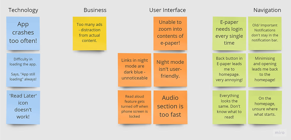
In the picture : User Pain points assorted into 4 categories.
Insights
1. Many users complained about the app's technology - it crashed too often, and did not load timely.
2. The reading experience was further hindered due to advertisements that were placed at different junctures of an article, which dramatically reduced the flow of reading.
3. The User interface problems pointed mainly to issues in three features- E-Paper, Night mode and Read aloud feature.
4. Users also had difficulty navigating within contents of e-paper, as the "Back" button did not lead them back to the page immediately preceding it; it took them back to the homepage!
5. Furthermore, the users complained about there was no hierarchy on the homepage, thereby making everything "similar-looking".
To further confirm these points, I decided to interview users who had used the app at least once, but discontinued (these people could be identified from the survey results). 9 out of the 15 identified people were willing to be interviewed.
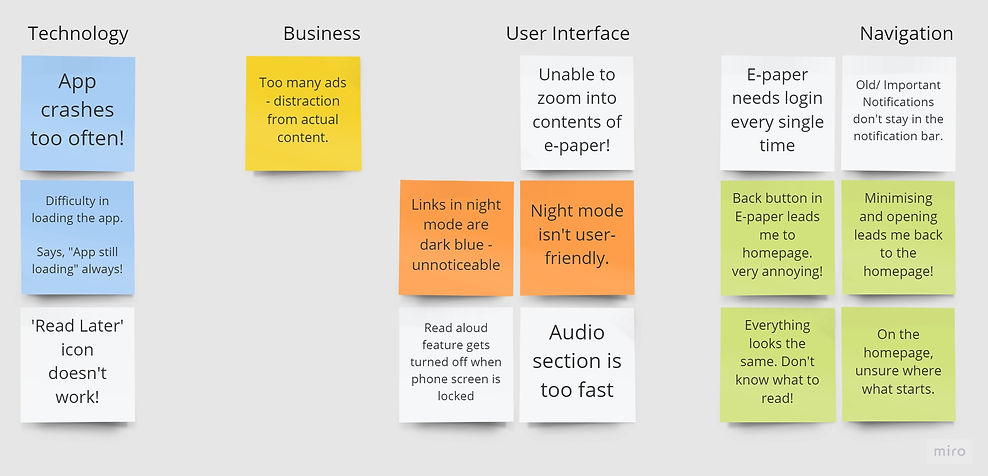
In the picture : Coloured boxes indicate the pain points confirmed through personal user interviews as well.
On interviewing them, these individuals confirmed >50% of issues that were brought up by reviewers on Playstore. Due to a time restraint, I decided to look more closely at problems that were confirmed by both categories.
STEP 3 Defining the problem
Next, I placed the points on an Effort vs. Impact graph, to determine which pain points can be resolved with the least effort, but yet yielding maximum impact. The Low Effort-High Impact quadrant (and certain points around it) were identified, to go further ahead.

In the picture : Pain points in the Low-effort High-impact quadrant are identified
The problem was therefore streamlined further. The problem statement would encompass the following-
a. improving the interface of the Night mode
b. troubleshooting navigation in the E-paper and
c. attempting to devise a hierarchy of content on the homepage.
STEP 4 Empathise
To proceed, I created 3 User Personas, that reflected the majority of users who were facing the three main problems - Ineffective Night mode interface, poor navigation in the E-paper, and an unclear heirarchy on the homepage.

better Night mode?
Avinash needs
so that he is less strained
better navigation in the E-paper?
Sundar needs
so that he can maintain his habit of reading the news, but digitally.
Better heirarchy on homepage?
Preeti needs
so that she chooses the Hindu over other apps.
STEP 5 Iterate and Prototype
User 1 - Avinash
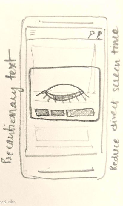
Avinash is a young professional who works on a busy schedule. In order to stay up to date, he wishes to use the Hindu app. However, spending a lot of screen time at work, he feels strained.
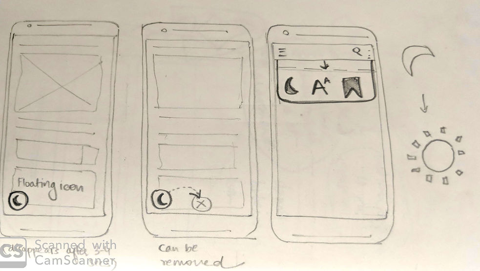
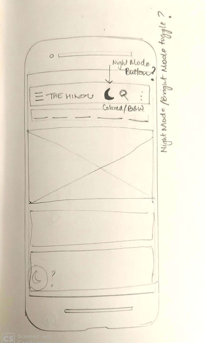
In order to improve his experience, I decided to improve the night mode option.

User 2 - Sundar
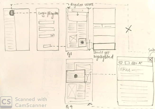
Sundar finds it difficult to use the E-paper, a feature he has signed up for. He isn't tech-savvy, but wishes to be, which is the reason why he has shifted from a print newspaper, to the app. In order to improve his experience, I decided to improve the accessibility to the E-paper, and navigation within the E-paper


User 3 - Preeti
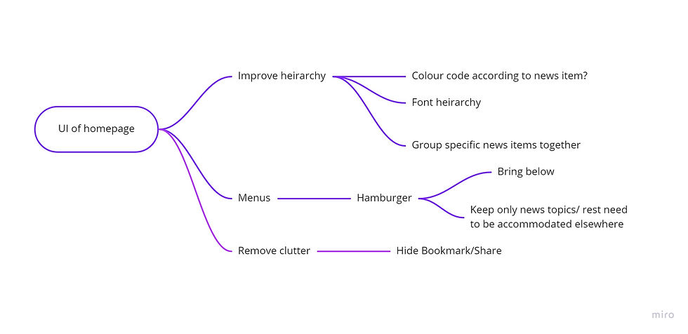
Since Preeti is quick in making decisions, it is important that the homepage of the app is impactful, and doesn't appear chaotic. In order to ensure that the Homepage is clean, it needs to be revamped. The colours, font, position of menus, categorising of news items and overall layout are to be looked after.
STEP 6 Creating Mockups
New Homepage

Here, the homepage is cleaner than before. The menu has been shifted down, for easier access to the user. News about a particular topic is grouped together.
Overview of the new Menu bar
Share and Bookmark

Share and Bookmark icons now appear only when a topic is long-pressed. This makes the interface look less cluttered. The extra space is now utilised to categorise news items according to colour codes.
Night Mode / Enabling Night mode
The Night mode can be enabled from a pull-down menu that also has access to other shortcuts like "Increase Font Size, or Read Later". Since Blue light must be avoided in Night Mode, it is substituted with shades of grey.


